..So beautiful it hurts….literally. As a Silicon Valley resident for who as many years as I can remember, and as a lover of beautiful design and architecture, I just had to share this piece of news with you guys.

I’m not sure how many of my readers actually keep up with Apple aesthetics or architecture in general. But the Architecture Firm Fosters + Partner’s opened the doors to their futuristic UFO also known as Apple Park Campus sometime in 2017. This piece of Architecture has been talk of the tech and architectural world right there next to fellow tech giants Google and Facebook, and possibly one of the last things Steve Jobs had approved of before his untimely passing.
I have to say, I’m quite lucky to live in the bay in which these tech giants have grown and thrived over the years, and also surrounded by the architecture they inhabit. Granted, I’m not sure I’ll ever get to step foot in some of these building, but who knows, maybe one day I will.
The rumors had already been circulating at my firm months prior to the release of the news report of “incidents” occurring within the new Apple Park Campus.
Original Post:
Apple staff repeatedly walk into glass walls at Foster-designed campus, claim sources
While I have mostly been featuring mind-boggling architecture, of wild shapes and forms. Ideally though, I love the minimalist design approach. Clean lines, surfaces and edges (even though my thesis tries to blur these boundaries) and modern white boxes are totally my thing (even though I really despise the color white in my wardrobe).
And while I have an affinity for beautiful minimalism Apple Park Campus may be the pinnacle of this clean design aesthetic it, but gosh, is it problematic!
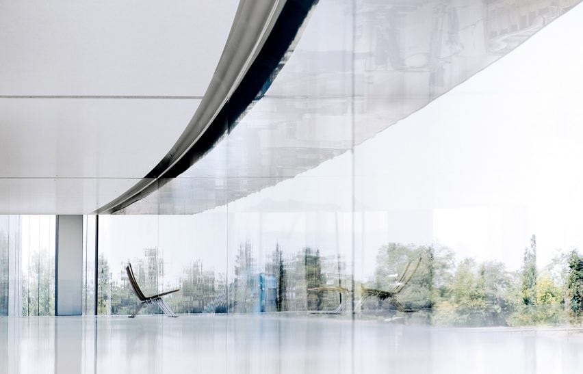
There’s something so incredibly ironic about this futuristic ring of glass.
Glass. ALL THE GLASS! Not just glass, but SEAMLESS glass! Can you imagine a continuous surface of glass? There’s no indicator of where it ends or begins. So, while glass is beautiful and makes a statement, it is NOT intended to be a wall. IT’S JUST. NOT. PRACTICAL. So yes, I’m laughing at the irony of this situation. Obviously, I’m not laughing at those that are suffering injuries, but this is seriously one of those moments where the client and architect are clearly not thinking about the users and the space. It’s ironic that the creators of the iPhone would create walls upon walls of glass with no indicators of edges that their employees walk into the walls which cause in injuries (i.e. broken noses).
Think about it, people running around this office on their cellphones trying to get to their next meeting, which is probably 180 degrees from where they’re standing due to the building layout: a ring for goodness sake! Having to run along the circular path is most likely going to cause issue, especially if you have back to back meetings where the rooms are really far apart. Let’s think about those people running through this glass building again, but this time they’re running around with their cellphones in their hands, checking where their next meeting is, replying to e-mails or texts, distracted. This is how you people injure themselves and end up breaking their noses because of glass.
But wait, there’s another side to it. Okay, okay. I’m giving the designers a hard time, I’m also going to blame this on the client because at the end of the day, it’s what the client wanted. It’s what Apple wanted, and at the end of the day the customer is always right. Sure we can help them understand the code of how things can and can’t be built. We can express the problems that may arise, but really, the client still decides what they want. It’s their money to do with what they will.

I should probably also mention that despite the impracticality of it all, I can see and understand the concept that’s on display with creating multi-level ring. In creating an open office that is an permanent loop, you’re forcing the users in space to engage with one another. The open office floor plan allows for communication to be more open and free. There are no walls, no cubicles that block human interaction from one another. So in an effort to create more human interaction in the tech-world, the best way to get people to engage with one another is to create a literal circular circulation that everyone HAS to walk through. I guess it could stimulate cross-department thinking, that is, if you’re the friendly type. But you know, that’s just another debate for another day (how these technology companies are set-up). I also get that that
Even if it’s trying to get LEED certification (which stands for Leadership in Energy and Environmental Design) for being a “green sustainable” building, it boasts more about it’s technology than addressing any real issues. For a building that claims to be helping the environment, it’s actually doing the opposite. Reports say that while the building occupies 3.4 Million Square Feet in terms of office and laboratories, car packs occupy about 3.5 Million Square Feet (including, 11,000 parking spaces, which by the way is STILL impacted – as told by my co-worker’s husband who works at the new building). You can’t boast about a green building when you’re still relying on your employees to get there via car versus any types of public transportation. I seriously wonder how that’s going to get approved by LEED (I still haven’t found any solid proof that it was approved).
Now, I know I’m kind of bashing on this building, but for good reason; at the end of the day it’s beautiful. I won’t deny that at all. However, I can’t turn a blind eye to the fact that it’s loaded with impracticality.
What do you guys think of the Apple Campus? I know there’s a visitor’s center, I should probably hit that up one day and take some photos to post here. I’d love to hear your comments/thoughts in the comments below!

Whoa…I can see how something like this could be very impractical indeed. This is just horrible. I have run into a window at my own office at one point, and that can be very painful (to be honest…I wasn’t paying enough attention myself lol…(hey don’t laugh at me 😂😂). But yeah, as beautiful as this looks…this could really be a very big problem indeed. Hopefully there haven’t been too many injuries so far. Great post as always!
LikeLiked by 2 people
Hey man, it happens to the best of us. Its happened to me at home walking into the glass door coming from the backyard back into the house. I left it open but someone closed it..*sigh* but yes, as lovely as this ufo ring is, its just very impractical.
LikeLiked by 2 people
Ouch…that must really have hurt 😢
Hopefully things like that don’t happen too often.
Yeah, I really love the look of the building, but wow…impractical is definitely the understatement of the year 😂😂
LikeLiked by 2 people
When I saw then showcase is at the last Apple event, I was just amazed. I would love to see it someday in person.
LikeLiked by 1 person
At least the visitor’s center, which is also on site, is open to visitors. I know that they’ve suspended tours inside the actual building though for the time being. I hope its temporary. I’d still love to see it.
LikeLike
That really is stunning, would love to see it in person one day.
LikeLiked by 1 person
i hope to also! (even tho it’s just closeby)
LikeLike
When you go (I’m sure you will😊) take photos and share them please 🌸💐🌸 You’re so lucky it’s close by for you!
LikeLiked by 1 person
Oh most definitely! 😀 The visitor’s center is open to everyone, so I can at least go t that. AH! I’m glad you’re interested in the architectural content of my blog!
LikeLike
It’s always a fascinating read 😊 plus your passion really comes across which is really nice.
LikeLiked by 1 person
AWW, thanks so much 🙂 You really have no idea how much that means to me!
LikeLike
You are most welcome😊
LikeLiked by 1 person
It truly look as beautiful as impractical, but the view from inside is probably amazing.
LikeLiked by 2 people
I second that.
LikeLiked by 1 person
It’s so beautiful!! Yeah, I know that it’s impractical and prone to injuries; but still it’s so beautiful!!! I would love to visit it someday (I dunno why but I have this urge to touch that glass wall XD)
LikeLiked by 2 people
I want to paint on it LOL
Like with a white pencil just draw and draw and draw….
LikeLiked by 2 people
Let’s do that when no one’s watching XDD
LikeLiked by 2 people
Deal!
LikeLiked by 2 people
LMAO You guys crack me up!
LikeLiked by 1 person
*grin*
LikeLike
“the best way to get people to engage with one another is to create a literal circular circulation that everyone HAS to walk through”
Or more likely run through as the ring design leads to the longest possible (enclosed) path between points… And they’ll likely be glued to their phones anyhow. ISTR reading once that spaces that encourage people to slow down and mingle (and provide alcoves and/or seating) work best for encouraging inter-engagement. IIRC Pixar has (or had) a huge central commons/crossroads with plenty of seating and a latte stand for just that purpose. Of course, both of those were pre-smartphones.
When I was on shore duty in the Navy, a great deal of interaction/work happened in the smoking area…. Precisely because people from different areas of the building were there and not going anywhere (at least for the time it took to finish a cigarette.)
Personally, I loathe the Ring… It maximizes travel time and the linear arrangement makes it difficult to physically group interrelated work groups. But then I’m very much of the functional/utilitarian school… I’m afraid I wouldn’t be popular as an architect.
LikeLiked by 1 person
Um, maybe it didn’t come across but I think the ring is impractical. The part you’re highlighting was me trying to convey my understanding of why they thought a ring would be a good idea. Because I don’t think it’s effective either. Like you said it makes routes longer. There are better ways to get people to connect, linear paths aren’t one.
I love design, sure this is a beautiful building, but like I said at the end I can’t stand impractical design.
LikeLike
I was agreeing with you… 🙂
LikeLiked by 1 person
🙂
LikeLike